8 UI/UX Principles for a Website That Converts
Not every beautiful website sells. Here are the eight UI/UX principles shared by websites that turn visitors into customers — and what to watch out for when bringing a design to life.
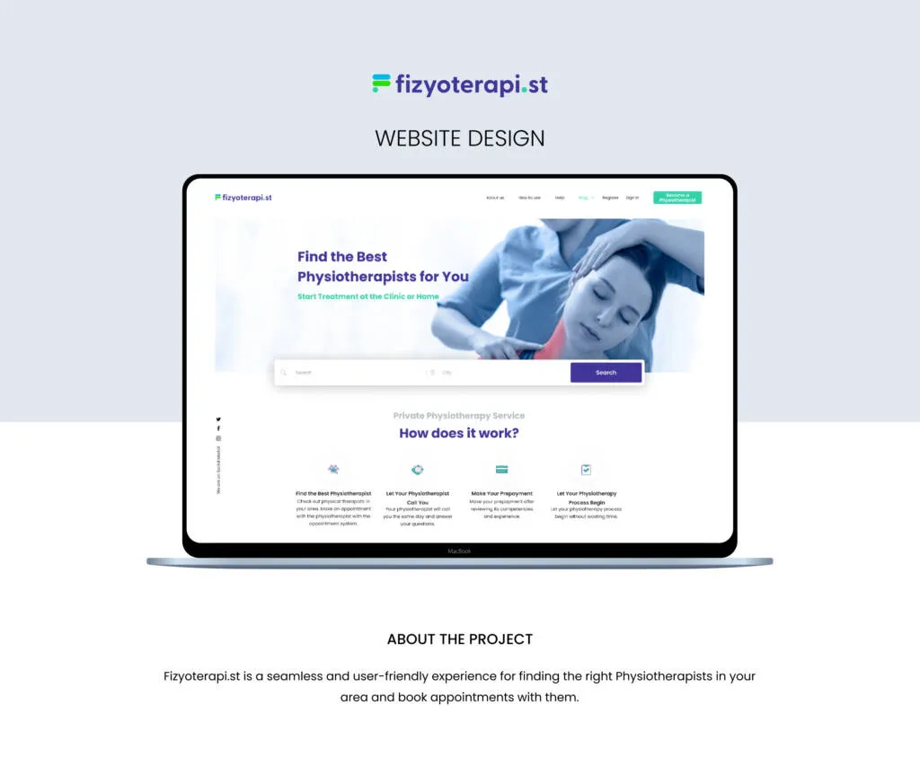
A website’s success isn’t measured by how “cool” it looks, but by how quickly visitors find what they need and whether they take action. From booking-driven products like Fizyoterapi.st to corporate marketing sites, these are the eight principles we stay true to.
1. Define one primary goal
Every page needs one main action: book an appointment, request a quote, explore the portfolio. Five competing buttons push users to click none of them.
2. Build a visual hierarchy
Size, colour, contrast and whitespace decide the order in which the eye travels across a page. The key message belongs at first glance; the key button belongs where the thumb can reach it.
3. Think mobile-first
Most traffic now comes from mobile. Starting on the small screen forces you to remove everything unnecessary — and simplifies the desktop experience too.
4. Speed is part of the design
A slow page makes even the most beautiful interface invisible. Optimised images (WebP), local fonts and a lean, script-free structure please both users and search engines.
5. Use a consistent design system
When buttons, form fields, cards and icons behave the same on every page, the learning curve drops and trust grows. A component library also keeps the site coherent as it scales.
6. Keep forms short
- Only ask for the fields you truly need.
- Show error messages right next to the field, in plain language.
- Clearly say what happens after submission.
7. Don’t neglect accessibility
Sufficient colour contrast, keyboard-navigable menus and meaningful alt text aren’t just legal requirements — they are the shortest route to reaching more people.
8. Measure and improve
Launch is the beginning, not the end. Use heatmaps, conversion funnels and A/B tests to see how each principle performs with your audience.
Good design is invisible; users only notice how easily they got things done.
From design to launch: the right technical partner
For an interface that looks flawless in Figma to perform just as well in production, you need a solid software foundation, performance optimisation and technical SEO. For brands that want to turn their designs into fast, secure websites that are easy to update from an admin panel, working with an experienced team such as Digital Küre, a corporate web design and digital advertising agency, is one of the most critical steps. When design and development share the same design system, the live site mirrors the original vision exactly.
Planning a new web project? Get in touch and let’s shape your interface together.