User Experience in Packaging Design: From Shelf to Table
Your product gets only a few seconds on the shelf. Good packaging wins those seconds; great packaging turns the unboxing into a moment people remember.
When we hear “user experience”, most of us think of screens. Yet packaging is used just like an app: it is noticed, examined, carried, opened, stored and finally thrown away. Every step is part of the relationship between the brand and its customer.
The shelf: the first three seconds
Shoppers glance at a product on the shelf for only a few seconds. In that time the package must answer three questions: What is it? Whose is it? Why should I choose it? That is why a clear information hierarchy, a strong colour block and a legible product name matter so much.
The hand: touch and form
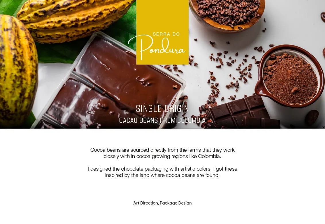
The texture of the paper, the weight of the box, the sound of the lid… Sensory details directly shape how valuable a product feels. For Serra Do Pondura chocolate we combined the colours of the land where cocoa grows with a textured paper surface, so the product feels crafted the moment you pick it up.
The unboxing: a small ceremony
- Intuitive opening: it should be obvious where to open without thinking.
- Rhythm: layers should reveal the surprise step by step.
- Re-closability: if the product is not consumed at once, the pack should support that.
Sustainability is a design decision
Less material, mono-material recyclable structures, water-based inks… Sustainability is no longer a bonus but an expectation — and when it is designed in from the start, it often lowers costs too.
Good packaging protects the product; great packaging tells the brand’s story.
Getting print-ready
Even the most beautiful design can get lost in a badly prepared print file. Dielines, bleed, colour profiles and material-specific proofing should be planned from day one.
Preparing a new product family? Browse our packaging projects or talk to us.